Title change

After progressing through my project, I realised that my title for my project was no longer relevant and I needed to change it to something that was more applicable.

The title before was “Identifying Aura” but I have changed it to “Revealing the Unseen”

Experiment Eleven // Lighting Room 1st shoot

One of the main things I took away from these experiments is how important the right lighting is for portrait photography. Because I had never really done studio portrait photography before, I was quite unaware of how important lighting situations were until the first experiment in the Lighting studio with Marcos and Dominique.

The first experiment was really informative, though I was underprepared for my role in being the model as I was very unaware of how to create images using my expressions. 

I also realised after taking the photos that I needed the images I was going to use to all be in similar framing as it wouldn’t work properly as a series of images. This meant that I needed to use the lighting studio again but was more prepared for what exact images I wanted to produce were to look like. We also tested in both the white and black studio, which gave for very different effects to the Images.

Experiment Ten // Photoshop exploration

The other experiments I did through photoshop was using photographs I took that were just of standard portraiture, where I set up lighting and used a self-timer to create the images by myself. I found that this was quite difficult because my lighting was okay, but wasn’t giving me a professional look. This was noticeable after the fact when I was editing the images through photoshop to portray colours with emotions. I experimented with different effects, using layers behind the subject and then also in front. Another option I was looking at was using words to incorporate within the imagery. Though after trying it, I wasn’t overly happy with how it turned out so decided to think of other ways I was going to be able to get better effects over the images.

Artist Model #4 – Cindy Sherman

Cindy Sherman is an American photographer and filmmaker whose self-portraits offer critiques of gender and identity. Though I am not looking at gender, I am looking at identity and how it can be portrayed through photography.
Below are a few selected works from Cindy Sherman over the years.

These images, are very extravagant. They are bright and bold, and all have different characteristics about them. Though because of this, it is different to other self portraits, where by instead of expressing sides of herself, she is creating characters and portraying them through the lens. Sherman creates personas for all of her characters and each photograph will have a different story. Though I don’t feel like my photographs will have various made up personas or stories, I can use these as inspiration to show different sides of my own character.

Artist Model #3 Aliza Razell

I was trying to figure out my project, and I was shown a photograph from the artist Aliza Razell and I resonated strongly with the multimedia effects that this particular series shows. I really like the effects that watercolour can give, and with the combination with photography, it was such an interesting concept.

The images are based off the Finnish word ‘ikävä’ which is used to mean the feeling of missing someone/-where/-thing. By looking at the images, you can really feel the longing which gives a feeling of nostalgia, which is based off of memories of a place, person or thing. This series of images can be found on Aliza’s Flickr account, where she also has many other series that have a similar use of watercolour or multimedia properties to her photographs.
https://www.flickr.com/photos/ummatiddle/albums/72157640752592683/with/12373554584/

I think with these images in regards to my own project. I think that I want to explore the use of the colours and maybe create something using multimedia instead of just computer generated to give it more complexity and depth. Though I still will need to experiment with the photographs and research about the colour theory behind the chakras to understand why i’m using particular colours in the way I want.

Artist Model #2 – Tiffany Singh

Tiffany Singh has an installation at TePapa museum in wellington. I was told of the installation by a friend who recently visited the museum. I have not been able to visit myself, but the imagery and explanations of this experiment is interesting and I feel has some significance to my project.

Her installation is called : Total Internal Reflection

The description stated on the TePapa website is:
“How are you feeling? This experimental installation invites you to choose a colour based on how you feel right now. Press a button and become part of an evolving communal light sculpture.
Artist Tiffany Singh believes engaging with the arts can improve physical and mental health. She intends Total internal reflection to be an expression of our collective wellbeing through colour.”

Tiffany Singh, Total internal reflection (installation view), 2018. Photograph by Maarten Holl. Te Papa – retreived from https://www.tepapa.govt.nz/visit/exhibitions/toi-art/tiffany-singh-indras-bow-total-internal-reflection

She also has audio, which is an interpretation of the colour referencing the chakra eastern healing that is represented by colours. you can hear the colours by listening to the audio that is given to you via headphones at the museum, but we are also able to listen to them at home. https://hearcolour.exhibition.tepapa.govt.nz/

There is also audio that has the artist speak about her installation which is interesting as she speaks about what she is collecting from the social experiment, and how each choice has an important impact for the collection of data being received. She also speaks about what each of the colours mean through the chakra system, which I need to research more on so I can also understand the importance of the colours being used. https://hearcolour.exhibition.tepapa.govt.nz/artist/index.html

Artist Model #1 – Mads Perch

Mads Perch is a Danish-born London-based photographer, who has done a lot of editorial work for magazines such as Fast company, Wired, i-D, The Pitchfork Review and Oki Ni.
Though he mainly does work for companies, he also does his own personal projects.
A lot of his personal projects work around colour and photography which relates to my project. I am wanting to focus on a few of his projects and see how they can influence my own photography and post-production.


All photographs property of Mads Perch

I think his photographs relate to my project because they express emotion through the imagery while it being enhanced by the colours. I think that because you’re able to see through the colours, with them being slightly transparent means that you still get the emotion on the subjects face, but with the ones with opaque white, especially the one with it covering some of the face, you loose some of that emotion because it’s being blocked by the solid colour. I think that because it is white instead of a colour it also has a different feeling as its creating a void of colour instead of adding dimension.


How would this influence my project?
I think that it helps me with how to do placements of colour and the variation between solid and transparent overlaying with colour.
I also think that it helps to show me how to express ideas with overlapping colour on top of photographs, along with possibly ideas on how i’m able to get the effect of colours in my photographs post production. The images were made by having ink on acrylic or perspex and then places in front of the subject. I don’t think i would want to do it that way, but it helps with the ideas of being able to make placements of colour and then superimpose them on top of imagery.

Experiment Nine // Typeface

One of the ideas I had behind self-identity was handwriting. One of the things people look for when they identify people is their handwriting, as it’s a very unique aspect of someone.  I decided to create my own typeface based off of my own handwriting. 

I wrote out many times the alphabet and used the most aesthetically pleasing letters. I wanted to create something that was uniquely me, and through some basic knowledge of creating typefaces from previous projects, I was able to create Emahmaii Handwritten. I was able to create it to be a completely workable typeface. I originally wanted to incorporate it with the fingerprints and as graphical elements over/under the photographs. I didn’t end up using the typeface through my imagery but have used it through this exegesis as my header typeface. 

Experiment Eight // Digital Drawing

The first photoshop experiment I tried was to create a digital illustration of one of the photographs of my eye. I wasn’t quite sure what I was trying to achieve, but thought it could be an interesting element, or way of using photography but also a digital element. Though in the end, I didn’t really like what I was producing, and it didn’t really go with my theme of ‘aura’ much, so I decided to not continue with that any further. 

Experiment Seven // Finger prints

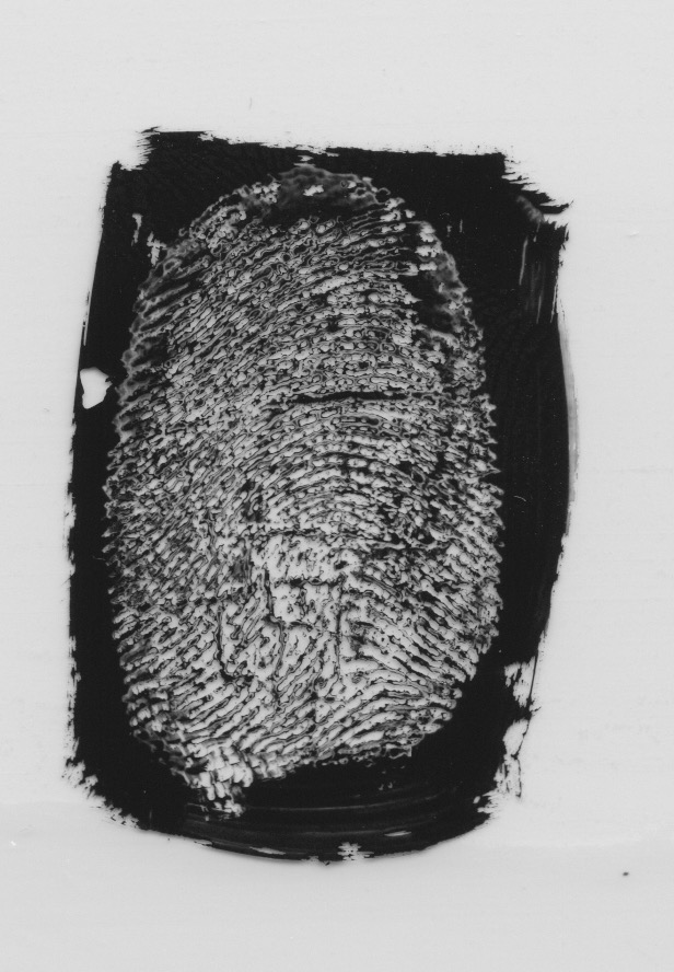
I used ink and used different fingers for various pressures. This kind of worked, and I was semi-happy with the result of the copies. When I was creating the prints, I accidentally pressed on glossy paper, which then gave me a different effect of pulling the ink up instead of placing it down, which I found gave more details of the fingerprints instead of pressing it onto paper. I found some plastic and painted rectangles with ink and created inverted prints. 

Using the inverted prints, I was then able to create lines and paths through illustrator so I was able to have a file I could work with to create patterns or use as an underlay on images, in the backgrounds.